
Last month we reviewed some recent changes to Flirt4Free in this blog article. Since it published, we’re sure you’ve noticed many more changes to both our aesthetics and functionality. You can stay on top of updates as they happen by watching the Flirt4Free Forums. But here is a recap of all latest as our 2020 refresh continues:

First, we’ve gone with a more minimal layout for our main page. Model names and other information was made smaller and less intrusive on your visual browsing experience. The color-coded dot next to their name will let you know, at a glance, each model’s current room state. Flirt blue for free chat, pink for Party Chat, bright yellow for a group show, and gold for premiere. The interactive icon will also let you know if interactive shows are available, and what devices are in play. When a model is in private a small tag in the corner of each profile pic will let you know if more users can join (multi-user) or if our voyeur option is available.
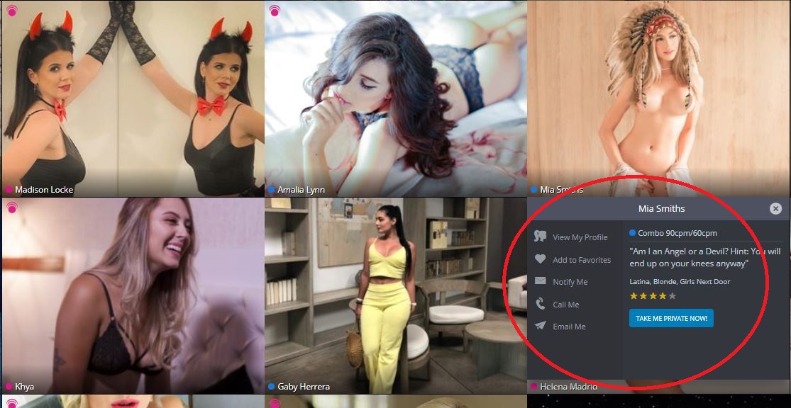
When you’re ready to dig a little deeper and learn more about a camgirl who caught your eye, we’ve changed the model info flyout into a simple dropdown too. This makes the menu cleaner and conveys more info at a glance. All the quickest way to fire up a new connection are right there for the clicking. Turn on email notifications, add her to your favorites, or jump into her chatroom with both feet and see if sparks fly.
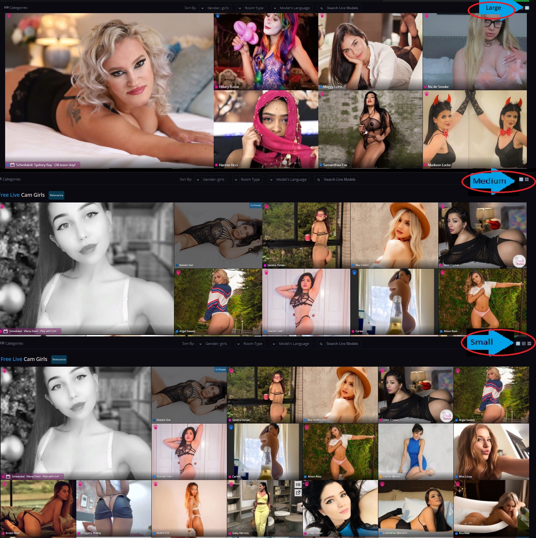
A few more main-page additions: You now have the option to have line-of-sight on more models at once. You can reduce the size of each chatroom preview by clicking the tile button in the top right corner. Large, medium and small. The smallest size lets you see the most girls on screen at once.
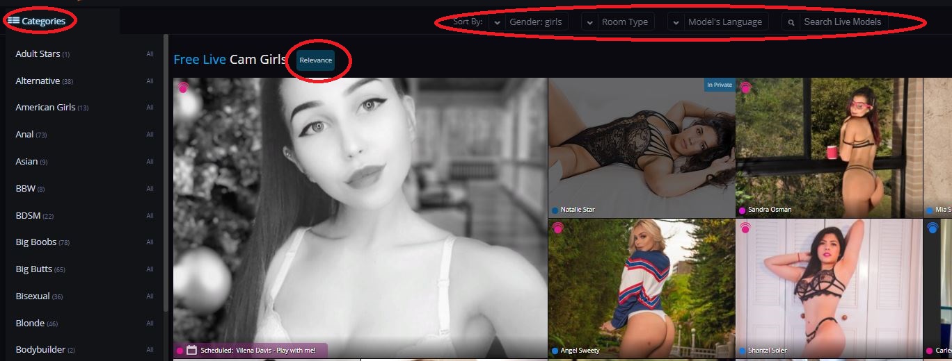
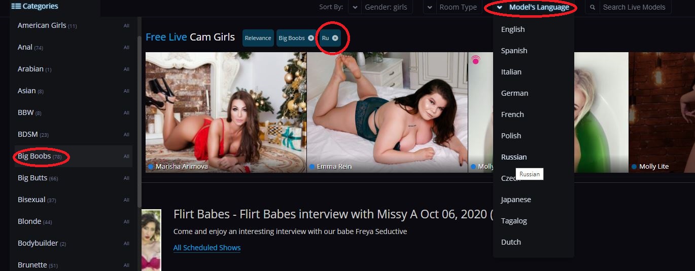
Going beyond the new visual layout, we’ve also added intuitive ways to search, sort, and narrow down your search for the ultimate online companion. First, we’ve moved the Categories list to be an expandable menu. We’ve also added search filtering by gender, room type, and new model view. Clicking any category, or choosing a search factor from one of the dropdowns above will add it to the filter bar. And if your search results get too narrow, just “X” out any of the criteria.
Under the Hood
We also did some tinkering around under the Flirt4Free hood, streamlining your “My Account” experience. We’ve created tabbed pages to give you easy, clutter-free access to your important account info.

We’ve condensed Billing and Purchase History into a single “Credit History” sidebar tab to make it easy to track your credit usage. We’ve also put your email settings beneath the main “Account Information” menu, located in the sidebar. All of you options for subscriptions, promo email blocking, and model notifications are now tabs under this single header.
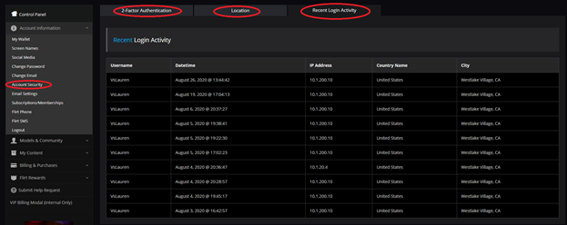
The “Account Security” option under this menu can be used to update your location and language settings, set up 2-factor authentication, and monitor your login activity.
With this phase of updates complete, we can move on to something more fun: stay tuned for an article on our new notification system: your customizable way of keeping informed and engaged on our model news, exciting site events, and more!


LEAVE A COMMENT
RECENT COMMENTS